 Zillet - Case study
Redesigning a trusted Zilliqa wallet without breaking that trust
A full redesign of Zillet, a non-custodial Zilliqa web wallet, plus a new create-wallet flow and a design system.
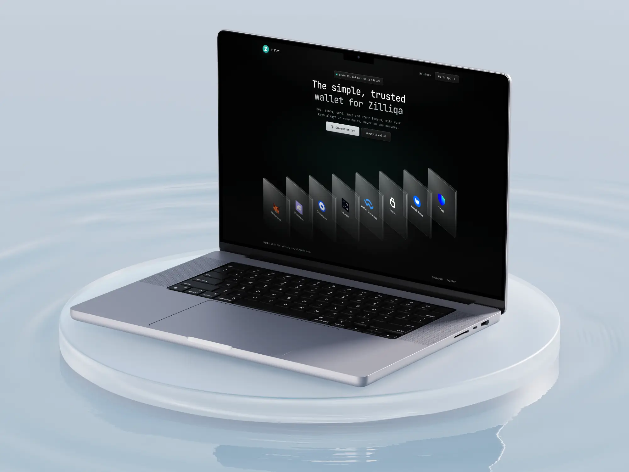
A wallet people already trust, with an interface that was holding it back
Returning users know where everything is. The goal was to modernise it and make safety clearer, without it feeling like a different app.
CONSTRAINTKeep the familiar structure.
CONSTRAINTNever hold user keys.
CONSTRAINTKeep the Zillet mark and teal.
What the old interface got wrong
01
Security was decorativeRiskiest method shown first.
02
No hierarchy in actionsEvery button looked the same.
03
Hard-to-read numbersDisplay font on addresses and amounts.
04
Inconsistent componentsMixed styles, glaring inputs.
05
No path for new usersNo backup or verification.
06
Crowded headerLinks competing with the wallet.
Four rules for every decision
A
Keep it familiarNew look, same layout.
B
Show the riskEvery method labelled by safety.
C
Stay calmColour only where it matters.
D
Be consistentSame action, same component.
Six rounds to get there
R1
Liquid glass, violet accents, new layoutToo unfamiliar, dropped.
R2
Brand palette, neon mint and navyToo loud, mint became a signal only.
R3
Original structure, rebuilt in graphite glassThe turning point, familiar again.
R4
Crisp bezel glass, display typefacesKept the glass, dropped the fonts.
R5
Command-palette access listHid the risk comparison, reverted.
R6
Final, darker glass, monospace, one systemDarker, simpler, consistent.
A small system, applied everywhere
COLOUR
Base
#040505
#040505
Text
#d0d5d8
#d0d5d8
Secondary
#9AA3A7
#9AA3A7
Tertiary
#7D8589
#7D8589
Signal
#36ECDE
#36ECDE
Safe
#34D27B
#34D27B
Caution
#FF9F2E
#FF9F2E
Risk
#FF5F57
#FF5F57
TYPE, JETBRAINS MONO
Fixed-width digits keep numbers aligned.
Page title20 / 500
Section title18 / 500
Body and inputs, zil1chvkbj32k5hb14 / 400
Secondary text13 / 400
FIELD LABEL11 / 500
COMPONENTS
Primary
Secondary
Small
Input · focused
Hardware / extension
Phrase / file
Raw key
Count + colour, readable for colour-blind users.
SPACING · RADIUS · GLASS
4
8
12
16
24
8 · controls
12 · insets
16 · panels
Glass panel, dark fill, metallic edge, soft glints
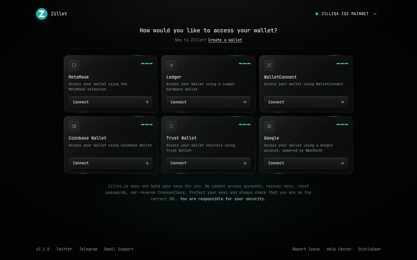
Connect a wallet
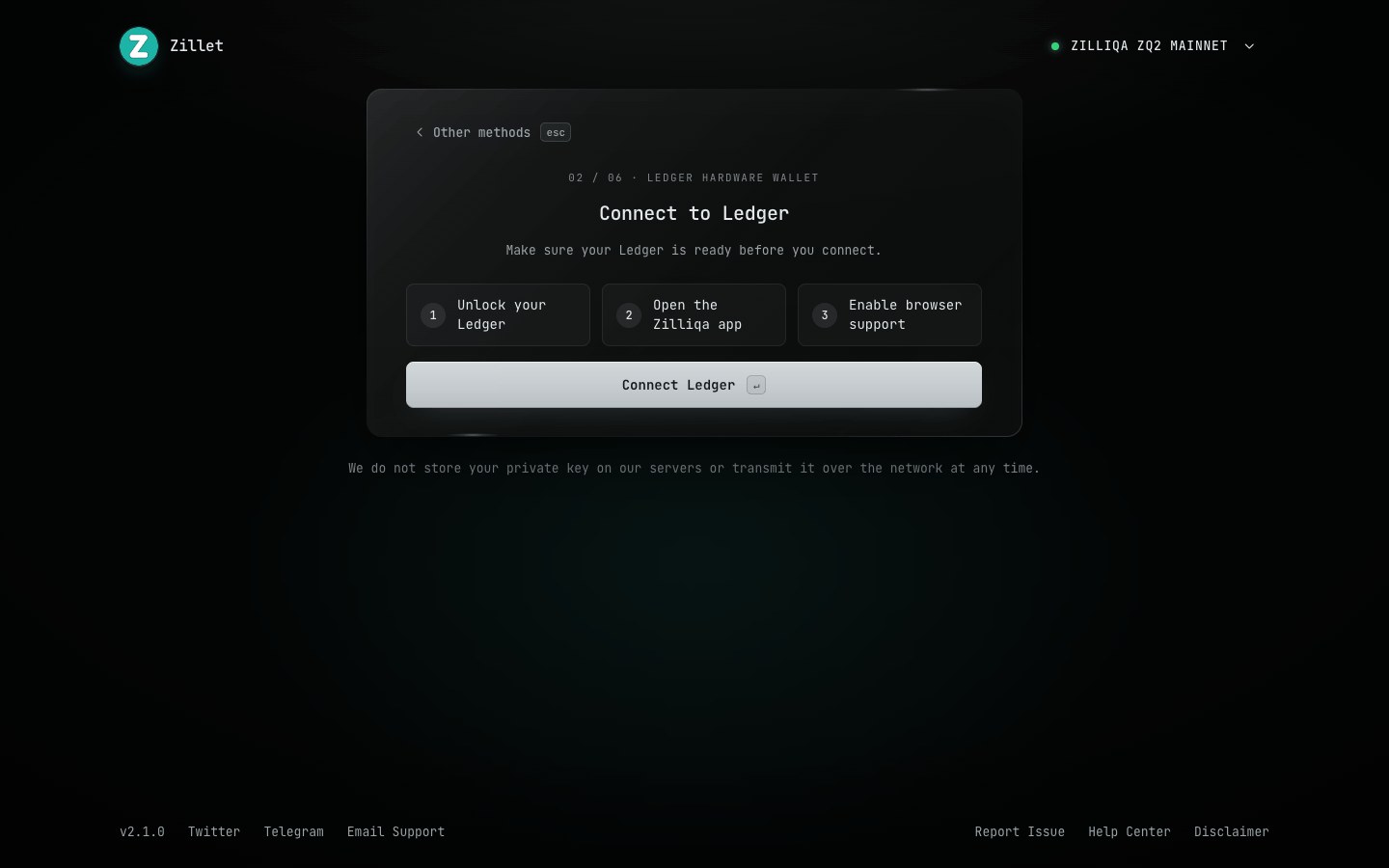
Create a wallet - new
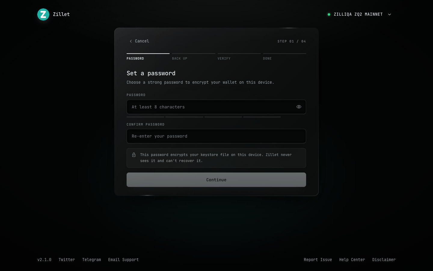
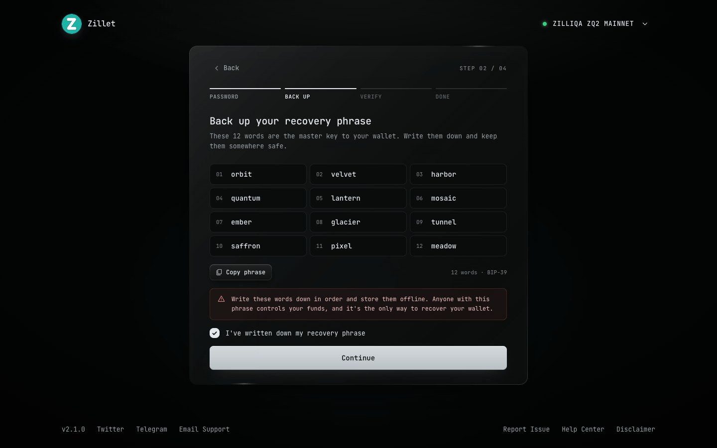
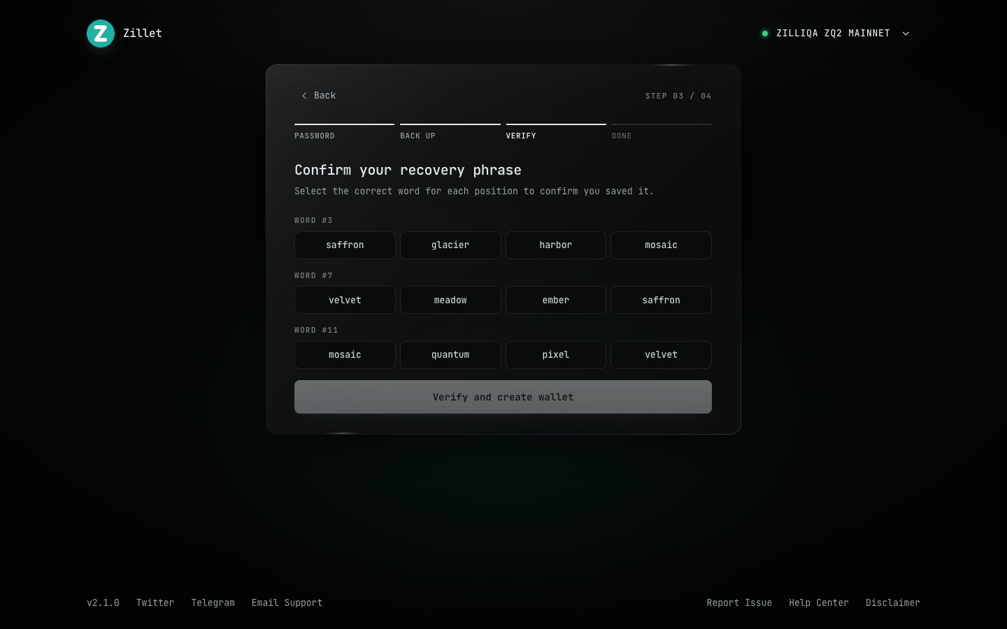
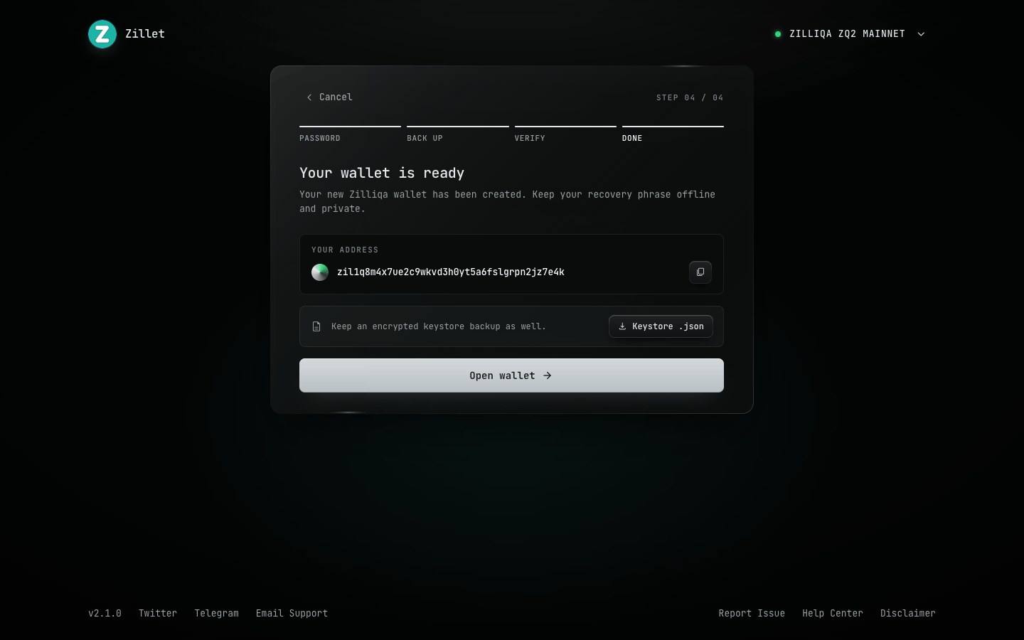
Drag to compare
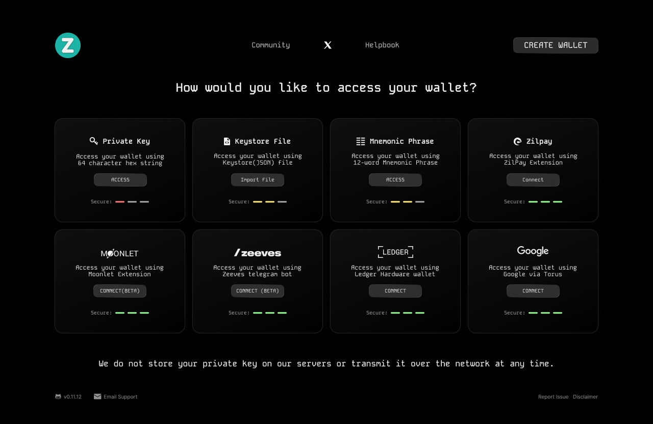
Access. Safer methods first, risk on every card, one clear button each.
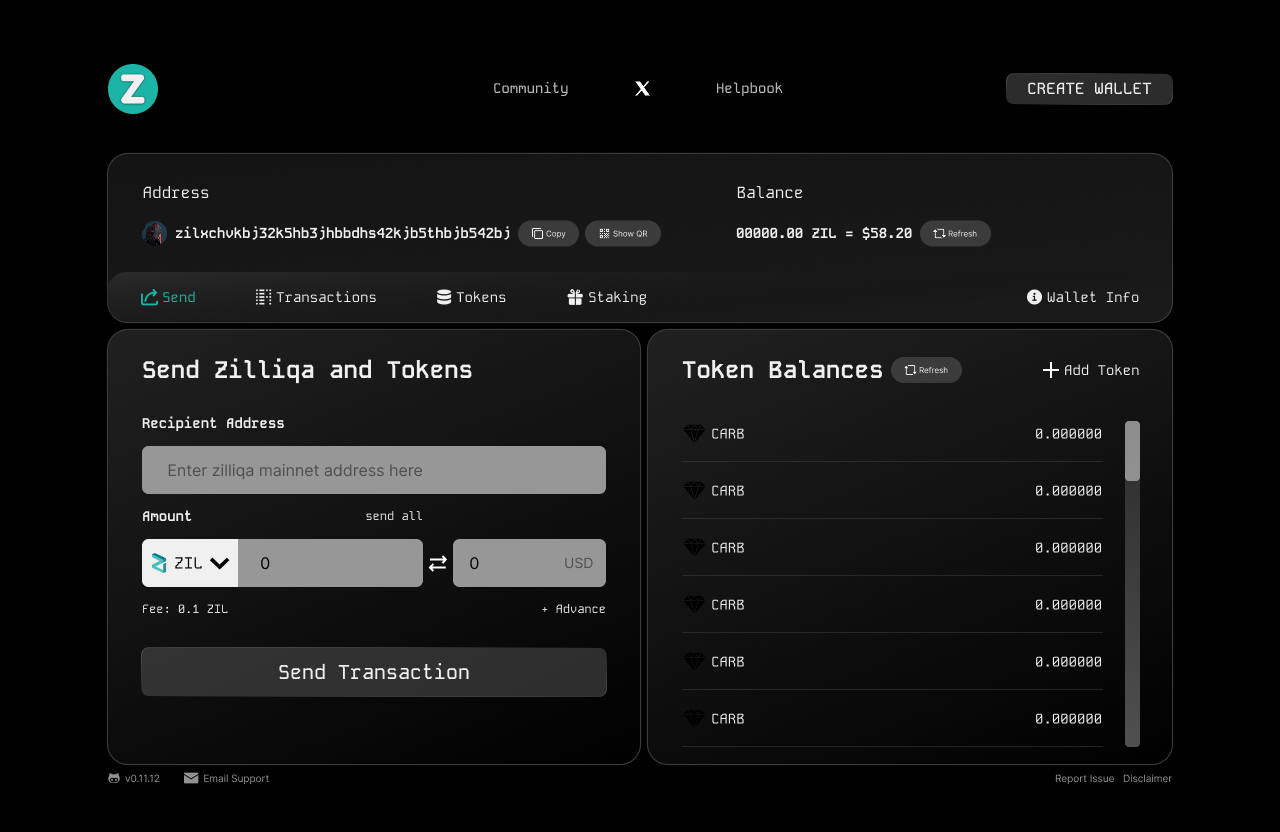
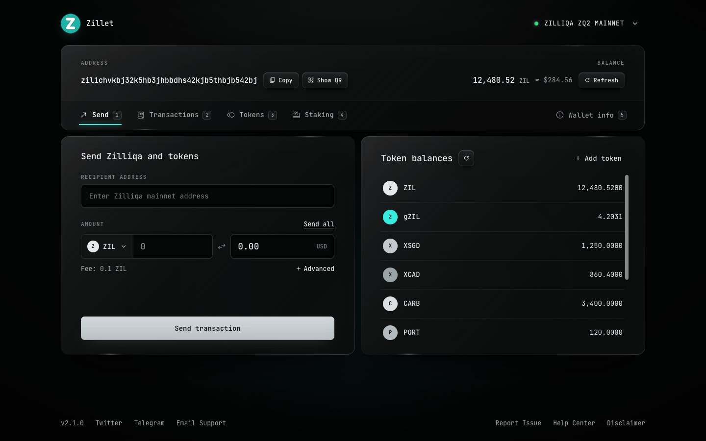
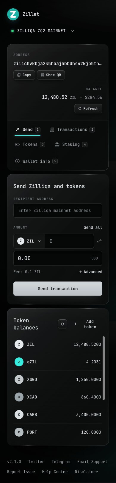
Send. Dark inputs, one primary action, aligned numbers.
Built to reflow, readable by default
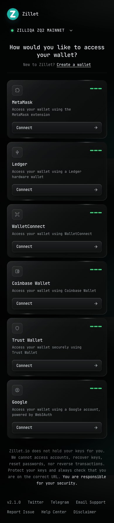
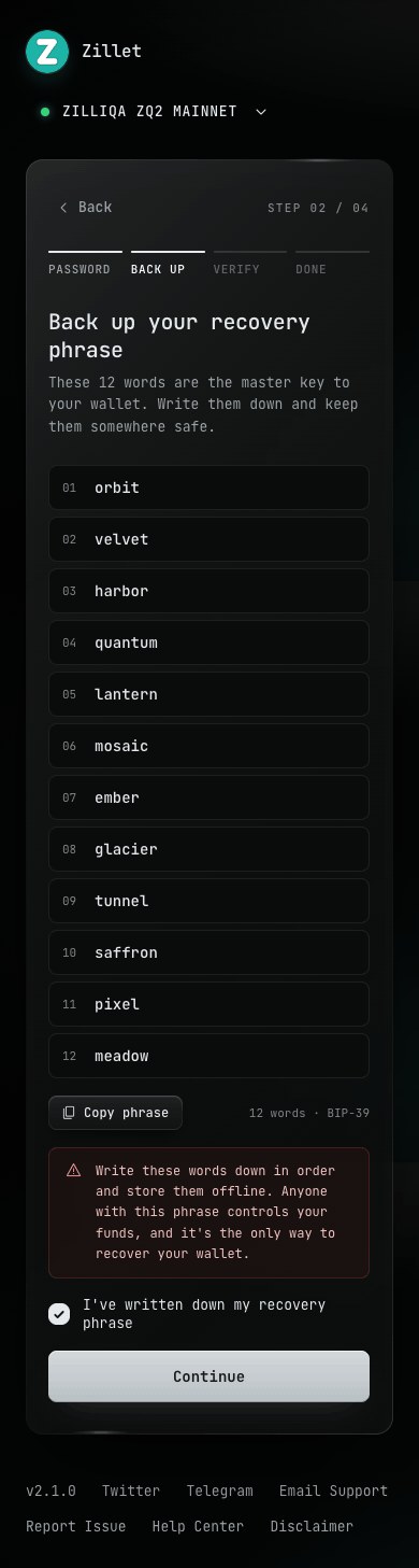
15.8:1Text contrast. All greys pass AA.
1-5 · esc · ↵Keyboard shortcuts.
FocusClear focus rings, written errors.
What changed, and what I'd measure next
WHAT I'D TEST NEXT
Safer connectionsFewer private keys pasted.
SpeedNo slower for returning users.
BackupsPhrase confirmed first try.
FamiliarityStill feels like Zillet.
Trust is a layout.
Familiar structure beat visual novelty.
Restraint scales. Fewer options, stronger system.
{{ liveCap }}
Tap the highlighted buttons
{{ lbTitle }}